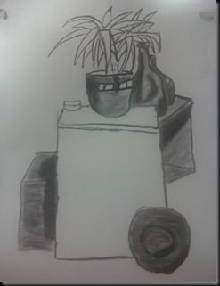
Wednesday 20 October 2010

Developer’s Blog – Post No. 10

Today was FUN! we began the first stages of transition into our design unit as we got to create a sort of chimera, a mix between a couple or many creature. The one i picked was a mix between a crocodile and a Velociraptor, i dubbed him the Crocoraptor. The Crocoraptor has a crocodile head but a raptor’s body, this was to make the croc much more of a predator, as they're already very dangerous the only way i could think to improve them was to make them more agile on the ground. Below is my Sketch of my creature i designed.

101019_125441

After the initial sketch i then looked at the form and then the skeleton and created two separate drawings to give a little sustenance and believability to my design. These images are below.

 101019_125458101019_125513

The final stage to this was to show i had a full understanding on how my creature would move and is limitations. So i began to do some thumbnails of this, the whole page is below

101019_125531

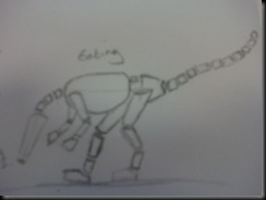
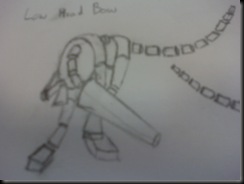
The first one is of the creature running, the second is of him humping into the air, the third he is eating, the fourth he is bowing his head and looking and the fourth he is prowling/crouching and looking backwards. Below are close ups of each of these stances, though forgive me for the poor quality.

101019_125546 101019_125601

101019_125615

101019_125631 101019_125645

I really enjoyed today, and i believe it is one of the days where i produced a much better standard of work than i am used to with my drawing skills. as well as showing some understanding on how my created creatures body would move. Id like to do more of this in future and so will be sure to practice these movement studies upon each chance i get, though i am unsure if any will make it to my blog but keep an eye out.

Any constructive criticism or nice things to say please post a comment.

Thanks for reading and Kind regards

Daniel Young

Developer’s Blog – Log No. 9

Yesterday we began to look again at real world objects but this time that we draw from reference images. Also this time we were given the chance to draw a form study of an animal of our choice.

101019_125335

Can you guess what it is?? its a crocodile in case you cant. The form study shows the main masses of a form, or body. for example in this i have the head, the jaw, the body, legs, tail and also a bit in-between the body and tail which represents the mass as the body slowly turns into what is the crocodiles tail. I think this form study is fairly accurate though i do believe the head and jaw may need to be longer.

The next thing i drew was a skeleton of an animal of my choice, for this i chose a rat. The image below is the one i produced;

101019_125353 

As drew pointed out rat skeletons are unique as they're the only ones that can squash themselves in to compact to the size of their head. The skeleton i drew in my opinion is fairly accurate and is a close representation of what an actual rat skeleton looks like. If I'm wrong please tell me where and why =] thank you.

Then later in the day we went onto more life drawing, this time of one of our peers, i chose André. The main fault with my image is it does not look fully like him, or it looks more like a younger version of him, maybe catching his child like qualities more than the physical image, The image i produced is below.

101019_125409

After this i also mixed him with a frog, the image itself is not very good, but it was fun to draw.

101019_125427

I think i need to learn to be able to draw from life better, as i can draw from an image much better than i can from looking at someone, this is probably an area i should improve on in the near future.

Thanks for reading and Kind regards

Daniel Young

Tuesday 19 October 2010

Developer’s Log – Log No. 8

On the Tuesday of last week we then began to look at the human anatomy and part of animal anatomy and how the two relate to one another in regards to both muscle and bone structure. Drew gave us a lecture about this and then sent us away to do our own drawings of firstly the skeleton, mine ended up looking rather disproportioned as you can see below, then he asked us to do a sketch of the muscles in the human body(also below).

 101019_125214 101019_125223

I don't like these images, i think that though the bones and muscles have the general location and shape that the proportions are very much out, for example the skeletons legs are to short and the muscles legs, chest etc. are to wide. I think i could probably improve on my drawings of these with more practice and in future is certainly something i should invest my time in doing.

Then on the Wednesday Simon brought in a model for us to draw reference from, the model showed part muscle, part skeleton and part skin, to show the different layers and how they relate. The below images are those i produced upon referencing that model.

 101019_125232 101019_125325

The first being the whole body the second being just the skull. again there is much to be improved but also i think they are much better than my previous attempts. As i practice more later on some more posts may appear on this blog.

Any feedback is always welcome

Thanks for reading and Kind regards

Daniel Young

Developer’s Blog – Log No.7

I feel i must apologise from my lack of updates on this blog as of late, I’ve been feeling under the weather and have been spending a lot of time fixing my brothers laptop as he cant seem to keep it working for more than a week.

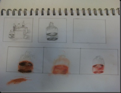
Last week we started off looking at colour. this included a lecture with drew where upon he discussed with us the colour wheel and went on to explain how the colour wheel can help us as designers to pick a combination of colours that works well together. He then went on to give us some exercises with some dry media and colour. The images i produced are below.

101019_125115

The first medium we used was the pencil, this was to create a sort of control and to see if we could grasp the tone in the colours rather than the colour themselves. Then we moved onto using colour. Ranging from right to left this was, Oil Pastels, Chalk and Pencil Crayons. In my opinion none of he images came out to well, though the oil pastels were my least favourite one to use. The Pencil Crayon drawing came out the best, as it captures not only the image but also the shades in the image better than my previous attempts with the other mediums.

After a short break we then came back to do the colour study but this time wetting the mediums we had, to make a more blended, natural and flowing image. The following images are what i produced during this task:

 101019_125130 101019_125148 101019_125157

101019_125205

On the top left you have my attempt with oil pastels, this attempt is hideous and I’m rather embarrassed to admit i made it. The next one along was pencil Crayon, i found it very hard to get the crayon to run properly into the water so it almost looks as if the pencil crayon drawing is just that and less of an wet piece. The next one was also pencil crayon but at this point i was starting to grasp the concept of how this media works a little more and how to do certain things in order to make the effect i wanted. And the final piece i quite like, again it was with pencil crayon, but the style looks much more loose and less like I've tried to draw a completely accurate representation of what was there like i did in the failed attempts prior to this one. Also i think the image captures some of the tone and well.

As always any feedback is appreciated

Thanks for reading and Kind regards

Daniel Young

Saturday 9 October 2010

Developer’s Blog – Log No. 6

To follow up on my last post that quotes can inspire pictures this time a picture reminded me of a quote. Here is the picture;

101009_200223

Now what quote do you think of looking at the picture above? ill tell you what one i thought of at the end and you can see if you get the same. Id like to point out how bad the cat on the rights head is before anyone else does, its awful i know, but i couldn't do it. I'm not happy with it to be honest but its an image, and Drew always says never throw anything away so its going on here =]

okay so the quote it made me think of was ‘Don't cry over spilt milk’. How about you guys? feel free to post them in comments below, it will be interesting to see what other people come up with

Thanks for reading and Kind regards

Daniel Young

Developer’s Blog – Log No. 5

Today i an idea struck me and i really wanted to draw it out as best as i could. Drew said that we should take inspiration from the things we see around us, but in my opinion we also gain inspiration from text, quotes and things people say, it was one of these that gave me my inspiration today. The quote itself reads; ‘You Are Severed From Christ, You Who Would Be Justified By Law, You Have Fallen From Grace’ – Galatians 5:4. This quote inspired me to draw the following image.

101009_175046  Below is a closer look at the picture itself

101009_175121

the image is simple but i think it captures what i was trying to draw, the bit i like best is the wing. Getting the shape of the kneeling body was really hard for me, and looking at it now i still don't think it is quite right. But all in all I'm happy with this, any advice throw my way please

Thank you for reading and kind regards,

Daniel Young
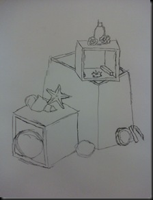
Thursday 7 October 2010

Developer’s Blog – Log No.4

This is just a quick update

In the early hours of this morning i sat down and i fancied drawing, so i drew a quick sketch of my friend. Now i admit the image was done from a photo not real life but i am very pleased with the image. I believe that this is probably one of the best freehand drawings that i have done and i just wanted to share it on my blog. So here is the image (below)

Marlene_03

The image is a pencil sketch, it took me about an hour to an hour and a half to do. The hardest part of this image for me was the hand. it was very awkward to draw and i was constantly rubbing it out and restarting until eventually i got what i was looking for, it isn’t perfect but it was the best i could do, if anyone could give me any idea of what i am doing wrong id greatly appreciate it. In general i am very happy with the overall image though any constructive criticism is always welcome.

Well again thanks for reading and kind regards,

Daniel Young

Developers Blog – Log No.3

Yesterday was a short day, only being 3 hours long. But the medium we used is one of the more different and difficult ones i have used personally, it was Ink and a stick.

Rather than practice our line making before hand our tutor told us to jump right in and get drawing. This didn't bother me much as after the previous two days i was itching to get starting and have a play with this medium. The first thing we drew on were big A1 sheets of paper using an easel as our rest for it. and i produced the following two images.

101006_094121 101006_102720

The results in my opinion weren’t very good, i couldn’t get to grips with how these sticks can make different styles of markings or even how to use the stick in order for them to do this. Feeling a little disheartened i took my break and came back ready to try again, this time in my sketch book. The first thing i did was go over an image id drawn the night previous of my dog.

101006_201456

101006_201519 101006_201505

The top image is the page as a whole, the below images are close ups of both the images i drew.

After this i drew the scene that was in front of me, the still life put together by Simon.

101006_201532

It is my opinion that i caught the scene better in my sketchbook than i had in the images prior that i had drew on A1 paper, but i was still not quite grasping how they can make some more unusual marks, most of my marks being just pen like marks.

i also drew to separate scenes, one of the table and two people working on it and another of the setup of ink and pots on the board they were resting on

 101006_201546 101006_201559

It is my firm opinion that i didn't do very well with the stick and ink. I think that this is probably not the medium for me in both its style and its mark makings. Out of a brush and a stick, id choose brush to make my art with.

Thanks for reading and kind regards,

Daniel Young

Developers Blog – Log No.2

Tuesday was another long day but it was good fun.

After Drew told us what we would be doing we jumped straight in to the drawing, this time we started by using pen. The first thing i practiced was some mark making techniques with the pen, as well as some shading techniques. Which i also proceeded to do with our second medium of the day, Ink and a paint brush. Below shows these techniques. (Left Pen, Right Ink and Brush)

 101006_201339101006_201359

After practicing these techniques i began to draw the still life before me, one using each of the mediums in order to create a comparison of the the two mediums, my skills with both and the difference between the marks they make. This image is below, on the left side of the page is the pen and on the right side is the ink and brush drawing.

101006_201349

I found i quite liked drawing with the ink and brush, the messy sort of style you can do with it very much appealed to my artist style so i began to experiment a little more trying different techniques, at the next point i even held the brush in a sumi-e style (traditional Japanese art)

101006_201416

After that image i drew another but in a normal way of holding the brush and produced the following image

101006_201426 101006_201442

The image on the left is the full page of which i drew on, the one on the right is a close up of the second image i drew. I am happy with this image cause even though it is messy it captures what i was drawing in a style that i quite like, and like to draw in. I did the image quickly too as that was the point of this practice exercise.

As a closure for this post id like to say that it was an extremely enjoyable day for me, and i am happy with what i produced with these new mediums. In future i hope to continue to practice with there and advance my drawing skills immensely.

Again thanks for reading and kind regards

Daniel young

Tuesday 5 October 2010

Developers Blog – Log No. 1

Today was long for me, as i got up early and didn't get home to until almost 10. That being said it was an interesting and worthwhile day.

We began our day with a short lecture from drew, in which he spoke about tone or value, positive and negative space as well as  contour and blind contour. After this lecture he gave us a still life to draw and told us to put into practice some of the things in which he had talked about. these below images are what i produced. Due to the picture being in a 3” x 2” box and my phone having a not so good camera some of the details are much harder to see so i apologise in advance for this.

101004_230047 101004_225932 101004_225942 101004_225957 101004_230009 101004_230032

The top four are tone and value sketches, the bottom left is a positive and negative space image, and the finally the bottom right is a contour image,also with contours of the light areas.

During our next session with Simon we were given an easel and charcoal and a much bigger piece of paper. For the first image we were to draw the contours and then shade in, which you can see below.

101004_194557

The next image we were given some charcoal on a meter long stick and told to stand at the full distance and draw with that, later on going back and cleaning up any mistakes you made, the following image is that one.

101004_194535

After this we were again given a normal piece of charcoal and asked to draw a negative space image in which i produced the following.

101004_194504

And finally we were again asked to draw a normal picture but with some shading which i produced this.

101004_194620

And that was my long but eventful day =]

Thanks for reading, and kind regards

Daniel Young